Friday, 29 January 2016

5. Documentation of My Final Outcome


 To begin my final piece, I enlarged my most successful biro portrait of Fran large enough to fit my PVC sheet. I pieced together the images to create the final large size with masking tape, so I was able to see the line work beneath and avoid damaging any of the materials I was using.
I used a permanent fine-liner to outline key areas of the portrait which wouldn't be as clear or defined in the paint.


As I added more and more layers and tones to the skin, I also started to experiment with the highlights in the hair, which also started off with white and very pale strands which were thin and delicate to create depth and detail in the overall image.

    Next, I moved onto the paint part of my outcome, on the reverse side of the PVC. Initially, I worked on the highlights as I would be shown on the top of the reverse side. This proved to be hard to get used to as I haven't often painted 'in reverse', although thankfully I got the hang of it eventually. As I added more skin tones to the skin, I also experimented with highlights in the hair, which also started with white and pale tones in thin strands for added depth and detail.


   Once I'd finished the majority of the face, I focused more on the hair and used as many different shades as possible, in order to make it look as natural as possible, despite the colour palette being so surreal.    
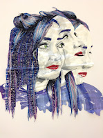
   After completing the painted section of the outcome I moved on to the stitch work where I incorporated a variety of colours which featured in the painted hair to highlight individual strands and shapes.
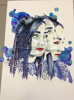
    I added layers of glue gun foiling in circular patterns and inked circular paper-cuts on a couple of different layers to add further depth and links to the artists that I have researched into.

    To complete the design, I cut away the excess PVC and cut into the clothing in the bottom of the portrait to 'neaten' the edges and create a more creative and distorted edge.

   Finally, I added each different inked circle and glue gun shape onto a different raised level of foamex to created a much more 3D effect for the final image.


4. Reviewing and Refining ideas

    From the photo-shoot, I used some of the most successful pictures and developed them into mini outcomes.


  Firstly, I created a series of distorted portraits in black biro pen, which was heavily influenced by Ricardo Fumanal; I mainly focused on the females as there is a lack of male portraits involved in my research. There was a variety of positions and distorted features across the portraits which gave me more of an idea of what looked most effective.


    I then experimented more with colours on acetate. My initial research suggested that inks created a much more vibrant effect, so I tested different colours and positioning on acetate portraits; the first one I tried was based on the interior of the portrait, which involved me injecting colour onto the clothing, rather than the background. This was less successful because it left the hair and face quite flat, whereas I wanted the same strength throughout the whole image.
    The second experiment was with the exterior of the portrait; this was definitely much more of a success because the actual portrait gave the impression that it was on a separate layer while the interior experiment lifted the clothing.


My final experiment was with a couple portrait of Fran and Adam, in the style of Agnes Cecile. Effectively, it was my own version of a portrait which I studied in the previous research. I had since developed my use of mediums from paint to ink as I felt that the ink created more of a naturally bright effect which dripped a lot easily in comparison to the acrylic.


3. Initial Ideas

Before I started to look at specific ideas for my final piece, I chose to develop ideas from my research by taking a photo-shoot to experiment with different angles, positions and faces.


This was a success as I managed to recreate photos from research such as Haejung Lee, Silke Werzinger and Ricardo Fumanal.


    One particularly successful portrait that I took was of couple, Fran and Adam, as they recreated an image from Agnes Cecile's research. Evidently, this picture was better than my first attempt with Ryan and Maddy, who are friends, as they didn't have the same natural chemistry and there was too much of a height difference to create the right effect.

     To create similarities between my artist research and my own work, I used females for the majority of the shoot; however, I used a few males to create more diversity and variety among the pictures I developed from the shoot.

Monday, 11 January 2016

2c. Agnes Cecile

                The final artist which I researched into, Agnes Cecile, inspired me most through her use of mixed media, bold techniques which create layered portraits which almost mirror a motion in one image, for instance, looking up, then down, or even feeling an emotion. One initial influence of the artists’ work was in the use of fusing and layering images with various voids where features of a face may lie; this sparked the other black biro portrait outcomes that I created as I chose to exclude some of the features across the portraits that I had drawn. For example, the trio of merged portraits of Fran excluded some of her features and left some small voids to create a digitally edited appearance.
              

  Another area of interest I have is in the varied use of colour, shape and texture, depending on the mediums or mixed media that is used. For instance, block colour is used to outline aspects of a portrait such as the clothing, whereas subtle gradients and shading are used in the softer mediums such as water-coloured portraits which suggest quite a wide variation to the style of her work.
                

Strengths of this work are highlighted in the consistent level of detail and effective colour palettes which can change how bold or subtle a portrait might come across. I would eventually like to incorporate my own work into this idea to create final outcomes that involve all creative aspects such as striking colour and a high level of detail.


2b. Ricardo Fumanal


                Fumanal’s clean use of layering drawings of people ultimately inspired my first mini outcome in black biro of two portraits merged together; the idea came from of a variety of portraits that had similarly proportionate portraits that were fused together to create an effectively distorted outcome. Although there is a very limited palette in his work, the depth and detail in his portraits are what interested me most as they are created using one consistent medium, in contrast to Silke Werzinger’s mixed media style.


In addition, the photo realism in the outcomes further contrasts to Werzinger’s illustrative style; however I am interested in merging the two styles together to create final outcomes in the future.


Among the many strengths of his work, there is attention to detail across each medium that is used in his collection of portraits, which is where I excelled, particularly in my mini outcome. Furthermore, the portrait photos are also successful as they allow a successful merging of two or more portraits, which I also found successful in later biro outcomes. One weakness of the work lies in the limited use of mediums and colour, as the work can appear less striking without even small flecks of colour; however, I personally overcame this issue by creating a variety of textures and depths in my work to maintain the level of detail.

2a. Silke Werzinger


 Initially, Silke Werzinger influenced me through the use of illustrative style portraits in her work, which introduced me to a variety of shading and ‘texture emphasising’ techniques. I also admired her use of colour and shape in individual outcomes as each portrait expressed a variety of bold pattern and strong line-work forms, to create an array of highly detailed faces and bodies. In addition, her excessive use of mixed media and layering in each piece inspired me to use more than one technique or surface to work from to create further elements of texture and detail.
 The style of portraiture that she uses is interesting as there is a variety of angles and perspectives involved in the models that she has worked from, giving me ideas for my own outcomes and photo-shoots leading up to the final piece. 
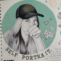
The strengths that I have found and developed during the research of the artist are mainly in use of bold colours and pattern that contrast with an illustrative line work portrait. This is evident in the self-portrait which features in my book, where I used layers of drawings and patterned backgrounds to create a portrait in the style of Werzinger. On the other hand, weaknesses that I have found are in the slight lack of detail that can be found in photo realism portraits or other mediums and materials, however this is due to the clean, illustrative style.


2. The Initial Research


To develop my ideas into further mini and final outcomes, I chose to expand research on aspects of key artists that have influenced me on my journey through the project: Silke Werzinger, Ricardo Fumanal and Agnes Cecile... (see posts A, B & C)